
Key Takeaways
- Choose a Logo Design Agency that proves its work with adaptability and long-term brand impact
- Focus on agencies that highlight USP and design philosophy instead of just showcasing client names
- Understand that 2025 trends point to AI-assisted workflows but human creativity still drives originality
70% of startups mess up their first logo. I’ve seen it happen again and again. They hire cheap freelancers, end up with something that looks fine on paper but breaks the moment it goes on an app icon, website header, or pitch deck. And then they wonder why investors or customers don’t take them seriously.
A solid logo is art, but it’s a strategy more. The best logo design agencies know this. They design for scalability, for memory, for the split-second impression when someone scrolls past your ad.
That’s why I pulled together a list of the top logo design agencies worth your time. If you’re serious about your brand, this list will save you from the mistakes I’ve watched too many founders make.
What To Look For In A Logo Design Agency?
Most people pick a logo design agency the way they pick a Netflix show, scroll for 5 minutes, click the one with a fancy trailer, and hope it doesn’t suck. That’s why half of the logos you see on startups look like they came out of the same template factory.
If you don’t want to be that founder who spent five figures on a design that can’t even sit right on a favicon, here’s what you should really check before hiring anyone.
1. Do They Design For Tiny First, Big Later?
Everyone can make a logo that looks great on a giant poster. The real test is whether it still works when shrunk down to 16×16 pixels as a browser favicon or on a mobile app icon. If an agency doesn’t show you how your logo scales down before final delivery, they don’t understand modern branding.
2. Do They Explain The “Why” Behind Every Line?
A logo isn’t decoration. It’s strategy distilled into a mark. If they can’t tell you why a particular curve, font, or color exists in your logo,walk away. You’re not paying for “pretty.” You’re paying for meaning that sticks in people’s heads.
3. Are They Obsessed With Consistency?
One-off logos are useless. The best logo design agencies think beyond the logo,they design your system. Your social media posts, merchandise, email headers, even your Google Slides should breathe the same visual DNA. If they can’t show you this consistency, they’re just another drawing service.
4. Can They Say No To You?
Sounds counterintuitive, but hear me out. The worst agencies nod at everything the client says, even bad ideas. The best ones push back. They’ll tell you straight up when your “idea” will hurt your brand. If they’re not confident enough to challenge you, they’re not confident enough to build for you.
5. Do They Have Logos That Aged Well?
Every agency shows shiny new work. But here’s the question nobody asks: how do their logos look five years later? Do they still hold up, or do they feel like a 2019 trend? If they can’t point to logos that survived time, you’ll end up rebranding sooner than you can afford.
10 Top Logo Design Agencies You Should Not Miss Out
Most “top agency” lists you find on Google are SEO stunts. They rank agencies based on how nice their websites look, or worse, how much they paid for placements. I’ve seen lists that put “best logo design agency in New York” in the title, then recommend firms that don’t even exist in New York. That’s the level of garbage floating around.
So, I have handpicked the agencies that are actually doing what they write in their “About” section:
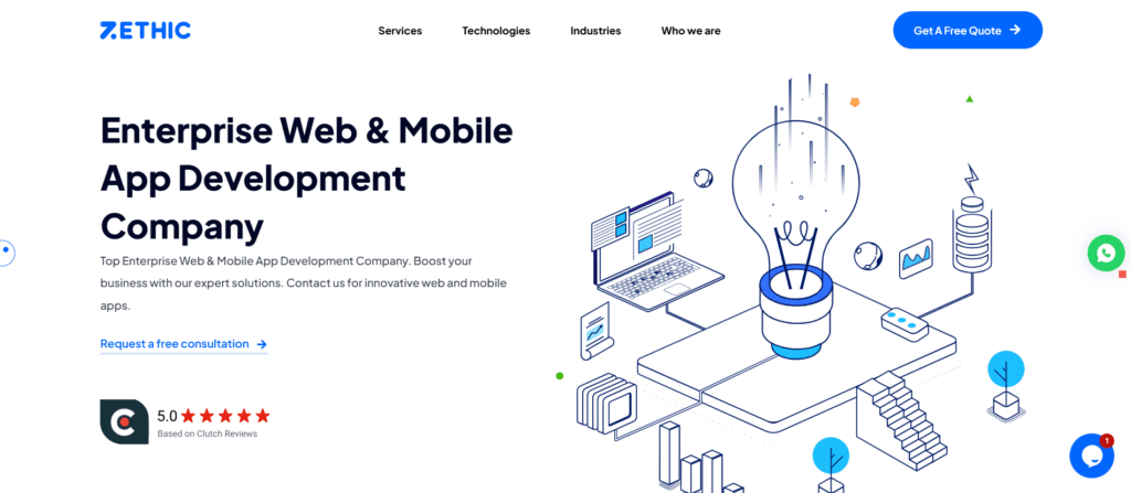
1. Zethic
Founded in 2017, Zethic is a Bengaluru-based logo design agency I’ve always respected for one simple reason: they don’t treat logos as decoration. Most agencies will sell you something that looks sleek on Dribbble but falls apart the moment it goes on an app icon or a Facebook ad. Zethic builds marks that actually work in the real world.
What I like about them is their product thinking. They don’t just hand over a logo file and disappear. They build systems, consistent colors, typefaces, spacing,that hold up whether you’re printing on packaging, pitching investors, or running performance ads. I’ve seen their work with Godrej, Decathlon, and Tata Power, and what stands out is how their designs don’t just look good on day one. They stay relevant, they scale, and they age well.
The reason I put them on this list is because they get something many agencies miss: a logo is not art, it’s a business tool. If you’re a D2C brand or a fast-growing startup, you don’t need a “cool” mark. You need an identity system that helps you sell, build trust, and stick in people’s heads. Zethic delivers exactly that.
What they bring
• Design systems that scale with your brand
• Logos tested for memory and multi-platform use
• Mobile-first adaptability
• Clean, modern identities that don’t chase trends
• Consistency across every brand touchpoint
• End-to-end execution, from strategy to delivery
2. Pentagram
Pentagram has been around long enough to prove one thing: longevity is its strength. They don’t rely on flashy gimmicks or trend-chasing logos. Their USP is in stripping design down to what will still make sense ten years later. That kind of clarity is hard to find in an industry obsessed with “new.”
What stood out to me while studying their work is how they focus on the system around the logo. The typography, the white space, the rhythm,it all feels deliberate. They don’t design for applause; they design for survival. And in a world where most logos expire in three years, that makes them impossible to ignore.
3. Landor & Fitch
Landor has a reputation for creating logos that feel global without losing character. Their strength lies in storytelling. While researching them, I noticed how they translate complex brand visions into visuals that are deceptively simple. They don’t throw a dozen elements into a mark; they find one sharp idea and execute it cleanly.
What I find interesting is their obsession with alignment between logo and brand positioning. For them, the mark is never just an aesthetic exercise. It’s a bridge between strategy and identity. That discipline shows in the kind of brands that trust them.
4. Wolff Olins
Wolff Olins is bold. Sometimes even polarizing. Their USP is pushing boundaries in ways most agencies wouldn’t dare. I realized while going through their work that they thrive on discomfort, logos that feel unfamiliar at first but grow stronger with time. That’s a rare design philosophy, but it works.
What I personally admire is their willingness to challenge conventions. They don’t settle for “safe.” They design for conversation. Their work is proof that logos don’t always need to be instantly likable; they need to be memorable and ownable. Wolff Olins leans into that truth.
5. Chermayeff & Geismar & Haviv
This agency is pure heritage in modern form. Their USP lies in creating logos that become cultural symbols, not just brand identifiers. When I looked at their past and present work, one thing was clear: they master timeless geometry. Clean lines, bold shapes, universal recognition.
While researching them, I noticed their designs are always brutally simple but deeply thought-out. They’re the type of logos that don’t need a manual; you just see them once, and they stick. That kind of minimalism, done with precision, is far harder than people realize.
6. MetaDesign
MetaDesign is all about systems. Their logos feel engineered rather than illustrated. While digging into their portfolio, I found that they excel at making brands look consistent across dozens of platforms. Their USP is scalability, they think about how the smallest detail will play out when multiplied across thousands of assets.
What I found refreshing is their approach to precision. Every color choice, every angle, feels like it has been pressure-tested. It’s less about visual drama and more about brand stability. For businesses that need structure, not just identity, this makes MetaDesign incredibly reliable.
7. Saffron
It may sound like an Indian religious name, but its roots are in Spain. Saffron’s USP is adaptability. Their logos often feel fluid, designed to shift depending on the context without losing recognition. While researching them, I noticed how often they design with motion in mind. Not just static logos, but identities that live and breathe on screens.
What makes them different is that they think ahead. Instead of just designing a mark, they create systems built for digital-first brands. In my opinion, that makes them especially relevant in 2025, where logos live more on screens than on print.
8. Lippincott
Lippincott sits at the intersection of branding and consulting. Their strength is merging research with design. I realised while studying them that they don’t treat a logo as the starting point; it’s the endpoint of a deep strategy process. That’s their USP: intelligence behind the visuals.
What I respect is their ability to balance numbers and design. They’ll run consumer studies, test perceptions, and then translate that insight into a logo. It’s methodical. Not romantic. But it ensures the logo is more than art, it’s proof of strategy.
9. DesignStudio
DesignStudio started in 2009, and you can tell they were born in the digital-first era. Their USP is building identities that move fast, perfect for tech and startups. While researching, I noticed they bring a sense of youth to their design, logos that feel alive in digital ecosystems. They’re not afraid of bold colors, modern typography, or experimental layouts.
What I found particularly sharp is how they position logos as part of a larger experience. Their marks don’t live in isolation. They’re meant to interact with motion graphics, UI, and digital storytelling. That forward-thinking approach makes them a favorite for high-growth companies.
10. Collins
Collins was founded in 2008, and from day one, they’ve had a knack for turning brands into cultural statements. Their USP is mixing design with strong narratives. When I studied their work, I noticed how they never stop at creating a mark; they build a full identity that feels like it belongs to a movement.
Personally, I think their strength lies in emotional connection. Their logos aren’t sterile or purely corporate. They feel human, expressive, and designed to make people feel something. In a crowded design world, that’s a serious differentiator.
What Is Happening In Logo Design Industry In 2025?
In 2025, logos are no longer just flat marks sitting on a website header. They’re adaptive identities that move, scale, and survive across devices and mediums. While digging into recent industry reports, I noticed a clear pattern: static wordmarks are losing ground to dynamic logo systems that can live on a smartwatch face, an AR filter, or a massive LED wall.
It’s not about design tricks anymore. Things have changed. Now it’s more about engineering recognition that works in motion and in stillness.
Another thing that stood out while researching was the cultural pivot. The era of muted minimalism and “quiet luxury” is softening. More brands are leaning into expressive, character-rich logos, marks that feel human, imperfect even. I kept finding examples of companies rejecting sterile design in favor of something memorable. The industry isn’t chasing “pretty” logos anymore, it’s chasing ones that carry soul and stick in people’s minds.
The Takeaway Moment
If you’re picking an agency, don’t get hypnotized by shiny websites or awards. Ask how their logos behave in the wild. Do they scale? Do they last? Do they actually help you sell? The right logo is less about aesthetics and more about building a system that won’t collapse when your brand grows. That’s the part most people miss, and that’s where the winners are separated from the noise.
Most logos look sharp in presentations but collapse in the real world, unclear on mobile, forgettable in scrolls, and impossible to scale. Zethic skips the fluff. We design logos built for real use, real screens, and real users. Book a free consultation and give your brand a mark that actually works.
FAQs
How do I choose the right logo Agency?
Choose someone with a strong portfolio, relevant experience, and who communicates well and understands your brand identity.
What file formats should my logo be in?
Logos should be available in multiple formats such as PNG, JPEG, and scalable vector formats like AI or EPS for best use across platforms.
What makes a good logo?
A good logo is simple yet distinctive, scalable without losing clarity, representative of the brand, and uses appropriate colors and fonts.
Why is logo consistency important?
Consistent logo usage across all brand materials reinforces brand recognition and builds trust with the audience.