

Key Takeaways
- Healthcare UX Design must prioritize real-world usability over visual polish to avoid becoming a silent risk.
- Only 11% of patients find health apps easy to use, exposing a serious gap between design and context.
- Build for chaos, not ideal scenarios—healthcare tools should perform under pressure, not just in demos.
- Involve real users early, design for trust and accessibility, and create constant feedback loops to stay relevant.
In 2023, 83% of patients reported feeling frustrated with digital health platforms, not because the treatment failed, but because they couldn’t even navigate to it. From appointment booking nightmares to clunky EHR systems, bad healthcare UX design isn’t just an inconvenience—it’s a silent risk.
I have seen that most UX design in healthcare still feels like it was designed in a boardroom, not a hospital room. It’s filled with assumptions, legal checkboxes, and zero empathy. Users, be it a cancer patient on a mobile app or a nurse managing shifts, are overwhelmed, misinformed, or just plain lost.
I believe startups should start designing like lives depend on it—because they do. Think accessibility-first, reduce mental load, and test with real users, not internal teams. That’s where real healthcare experience design begins.
What Is A Healthcare UX Design?
Healthcare UX design is where life-or-death meets clicks and scrolls. It’s not just about clean screens—it’s about reducing cognitive load for a nurse during a 12-hour shift, or helping a 60-year-old book a follow-up without calling her son. For founders and designers, it’s the backbone of any digital health product that actually gets used.
The industry is bloated with feature-heavy tools that look good in demos but fail in real use. That’s why only 11% of patients say healthcare apps are easy to use. But what actually is a gap? Real-world context. Yep! UX in healthcare isn’t a layer; it’s the product. Ignore it, and you’re just building more friction into a system already on life support. So better do it right.
5 Challenges In Healthcare UX Design Space
Look, I’m not writing this just to publish a blog and hit “post.” I’ve spent hours deep in research, dissecting what’s broken in UX design in healthcare, and what I found might just make you question a lot of decisions. Because honestly, if healthcare products were designed even half as well as food delivery apps, we wouldn’t be losing patients—not just figuratively, but literally.
Designing for healthcare isn’t just a UI challenge—it’s an empathy crisis, a systems issue, and in some cases, a lawsuit waiting to happen. So if you’re a founder or designer serious about enhancing UX for healthcare, here are five real problems no one’s blunt enough to talk about—until now:
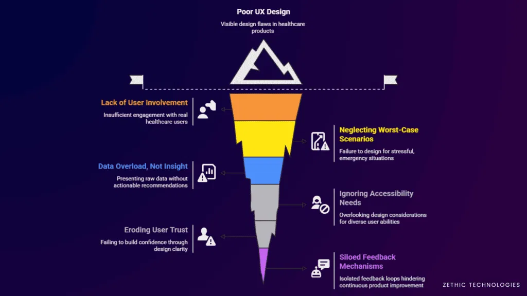
1. Designed in Isolation, Not in Context
Most healthcare products are built in labs, not in clinics. Designers sit with roadmaps, not with nurses. The result? Interfaces that look sleek but collapse in real-world chaos—emergency rooms, rural clinics, or low-connectivity zones. Healthcare experience design fails when it ignores context. UX isn’t just about usability tests; it’s about understanding fatigue, stress, and time-pressed environments.
2. Compliance-Driven, Not User-Led
When every screen is built to satisfy HIPAA checkboxes, the user gets lost. Legal and privacy requirements are non-negotiable, sure—but they often bulldoze usability. UX design in healthcare needs to balance legal and emotional needs. Right now, it’s skewed. You can’t “accept cookies” your way through patient anxiety or caregiver burnout.
3. Data Overload, Zero Interpretation
From wearables to EMRs, there’s more data than ever—but no design strategy to humanize it. Patients are given dashboards full of numbers, graphs, and warnings, with no clue what it all means. This isn’t data-driven care—it’s data-dumped confusion. Enhancing UX for healthcare means designing meaning, not just screens.
4. Accessibility Is Still an Afterthought
Let’s be real: if your app doesn’t work for a 68-year-old diabetic on an entry-level Android phone, it doesn’t work. Period. Most healthcare experience design assumes high digital literacy and ignores physical impairments, slow networks, and real-world diversity. Accessibility should lead the design conversation, not be added as a footnote.
5. No Feedback Loops, No Evolution
Tech companies iterate every week. And healthcare? Sometimes, once a year—if that. There’s no consistent loop of feedback from frontline users. Once a product goes live, it fossilizes. That kills innovation and stalls usability. UX design in healthcare must evolve with users, not just with funding rounds.
6 Key Strategies To Improve Healthcare UX Design In 2025
Not a lot of startups and companies follow this… but those who do? They’re the ones quietly redefining patient journeys, doctor workflows, and digital trust in healthcare. I took these strategies straight from products that are actually working in the field—not just in investor decks. Because in 2025, healthcare experience design isn’t a nice-to-have. It’s a make-or-break layer that decides whether your product gets used—or abandoned.
Here’s what’s really moving the needle when it comes to enhancing UX for healthcare:
1. Involve Real Users From Day Zero
No, not just a few patient interviews after launch. I’m talking shadowing nurses, watching appointment flow, understanding patient anxiety before you even sketch a wireframe. Great UX design in healthcare starts before Figma—it starts on the ground. Founders who embed real users into the design process build stronger, more intuitive tools.
2. Design for the Worst Case, Not the Ideal
Healthcare isn’t used in calm, bright rooms with perfect Wi-Fi. It’s used during emergencies, with shaky hands and emotional overload. Your interface should perform under stress. Use big CTAs, clean flows, and fail-safe alerts. Enhancing UX for healthcare means thinking like a paramedic—not a product manager.
3. Turn Data into Decisions
Don’t just show heart rates, glucose levels, or appointment history. Tell the user what to do next. Translate raw data into actions. Tools that win in healthcare experience design simplify decisions, especially for non-tech-savvy patients. Insight beats information, always.
4. Make Accessibility Your First Filter
Design as if everyone using your product is older, distracted, and using a budget phone in poor lighting, because they often are. Scalable fonts, strong color contrast, tap-friendly buttons—these aren’t design extras. They’re your core experience. UX design in healthcare without accessibility is broken by default.
5. Build for Trust, Not Just Conversion
In e-commerce, trust means reviews. In healthcare, trust means clarity. Where is my data going? Who sees it? Can I undo this step? If you don’t answer those implicitly through design, you lose users—fast. Privacy cues, microcopy, and visual consistency are silent trust-builders.
6. Create Feedback Loops, Not Silos
Healthcare is dynamic. So should your product be. Build feedback buttons inside the product. Collect anonymous insights from patients and staff. Then act. Continuous iteration isn’t just a startup flex—it’s critical to survival in UX design in healthcare. The best products evolve every month, not every fiscal year.
The Takeaway Moment
If there’s just one—just one—piece of advice you need to take from all of this: design like you’re solving for real people, not personas. That’s it. Behind every tap, scroll, or confused pause is a patient, a nurse, a caregiver, trying to make sense of your product in an already messy system.
Healthcare experience design isn’t about chasing perfect UX scores. It’s about making someone’s hard day a little easier. If your product can do that consistently, the trust, adoption, and impact will follow quietly, but powerfully. Everything else is noise.
Too many products go live, then double back. Reworking flows, fixing poor UX, patching over design decisions made in a rush. Zethic doesn’t work like that. They slow down where it matters, so you don’t waste time later. Start your project right with Zethic. Book a call now.
People Also Ask
Why is balancing usability and regulatory compliance a challenge in healthcare UX?
Healthcare UX must be both user-friendly and compliant with strict data privacy regulations like HIPAA or GDPR, which complicates design by adding security layers that can hinder simplicity
How does catering to a diverse user base affect healthcare UX design?
Healthcare apps and platforms serve patients, doctors, caregivers, and administrators, each with different digital literacy and needs, making it difficult to design a one-size-fits-all interface.
What makes managing healthcare data a UX challenge?
Healthcare systems handle vast, complex data sets including medical histories and lab results. Presenting this information in a clear, digestible manner without overwhelming users is difficult
How do complex workflows impact UX in healthcare?
Healthcare processes involve multiple stakeholders and steps, such as medication reconciliation or scheduling, resulting in intricate workflows that are challenging to simplify for users
Why is fragmented system integration a problem for healthcare UX?
Many healthcare systems and apps are disconnected, forcing users to switch between multiple platforms and logins, leading to a fragmented and frustrating user experience
What role does accessibility play in healthcare UX design challenges?
With a significant portion of users possibly having disabilities or varying tech skills, designing accessible, inclusive interfaces is essential but complex to implement correctly