


Start Your Project Today
Tell us about your project — we’ll get back within 24 hours

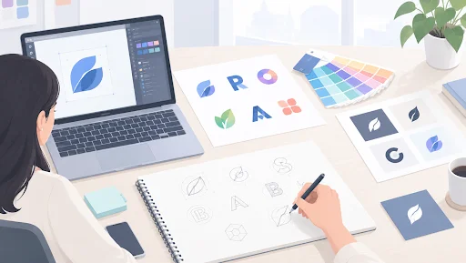
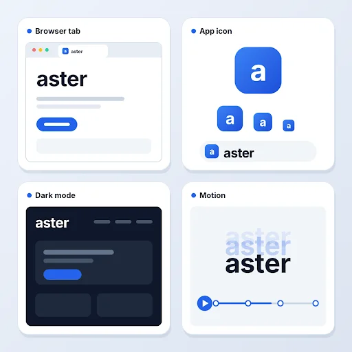
Many brands pick from the latest logotype trends by browsing inspiration boards, and only later test how the mark reads in a browser tab or an app icon. What matters is whether the logotype works at every size, on every background, and in motion. Knowing which logotype trends pass those tests helps a refresh stay useful for years.
A logotype is a logo made entirely of the brand name in distinctive type, also called a wordmark. Logotype trends are the shifts in how those letterforms are drawn, spaced, colored, and animated. They belong to the wider logo design trends in graphic design that shape brand identity each year.
A logo is the umbrella term. A lettermark shortens the name to initials, a logomark is a standalone symbol, and a combination mark pairs a symbol with the name. Logotype examples range from a clean custom sans-serif to a flowing script, and in each the typography does all the work.
A logo no longer lives only on a business card. The same logotype now has to work in places that test it differently.
The best logotype trends are the ones that pass all three. Apps built on familiar mobile UX patterns place the logo in a small header or icon slot, so one logotype file usually needs companion versions for each placement, which is why a logo design agency now plans for these contexts at the start of a project.
Six directions stand out, and most share one idea: the logotype is built as a system, not a single file.
Brands now design a full logotype, a simplified version, an icon-only mark, and sometimes a monogram together. Each version is tuned for a specific context, such as a website header, an app icon, or a social avatar. This keeps the brand recognizable even when the full wordmark cannot fit.
A custom or heavily modified typeface helps a wordmark become distinctive and recognizable. One altered letter or a distinctive curve is often enough to separate it from a name set in a stock font. Owning the letterforms also makes the logotype easier to extend into headlines and product screens.
Slightly uneven lines, freehand strokes, and deliberate imperfections are replacing flawless geometry. These details add warmth, which helps a brand feel more individual. The strokes still need enough weight to stay clear at small sizes.
Logotypes are now drawn with animation in mind, so letters can slide, stretch, or settle into place without losing legibility. Simple motion rules set at the start keep the brand consistent across video intros, loading screens, and app transitions.
Minimal still leads, but with more personality than the plain sans-serifs of recent years. Rounded corners, softer spacing, and one expressive detail keep a clean wordmark distinctive, and many software and fintech logotype examples now follow this pattern. Palette choice matters here, and color psychology in UX design explains how color shapes first impressions.
Shiny, embossed, and textured logotypes bring depth back after a long run of flat design. They work best as a secondary treatment, with a flat version kept ready for small sizes and print. Used sparingly, texture suits website banners and packaging more than interface icons.
Not every trend fits every brand, so the table matches each direction to the brands it suits and the main consideration for each. Read it alongside the wider logo design trends in your category, since a direction that suits a gaming brand differs from one that suits a law firm. A stylized logotype is also protected differently from plain text, because, according to the USPTO, a special form drawing covers only the particular depiction provided.
| Trend | Best For | Key Consideration |
| Logo systems | Brands with many screens and formats | Clear usage rules for each variant |
| Custom type | Brands with a short, distinctive name | Added design time compared with a stock font |
| Hand-drawn touches | Food, wellness, and creator brands | Stroke weight that stays clear at small sizes |
| Motion-ready wordmarks | Apps, media, and video-led brands | Motion that keeps the name legible |
| Warm neo-minimalism | Software, fintech, and service brands | One distinctive detail to stand apart from competitors |
| Tactile 3D and texture | Gaming, beauty, and entertainment brands | A flat version for print and one-color use |
Start with function, then style. Checking a logotype on a phone screen before launch costs less than adjusting it afterward. Four steps keep the choice practical.
Choosing the one or two logotype trends that match how your audience meets the brand works better than adopting every new direction. Review the shortlist with the teams who will use the files, such as marketing, product, and sales. Checking how a logotype reads in a browser tab or page header is also a basic part of website usability.
A lasting logotype borrows from logotype trends without depending on them. It reads at small sizes, holds contrast on light and dark backgrounds, and stays legible in motion, which a test inside a UI/UX design mockup can confirm. Brands that start there can treat a trend as a surface layer, and a small update to weight, spacing, or color is usually enough to keep a sound logotype current.
A logo design agency should hand over a working system, not a single image. That means the logotype is tested in a website header, an app icon, a video frame, and a printed page before it is approved. At Zethic, each logotype project starts from where the logo will appear and ends with the deliverables below.
Asking a logo design agency for these files up front keeps logotype trends usable after launch, and it saves rework when a new channel or product line appears.
Ram brings deep expertise in product strategy and system architecture across fintech, SaaS, and AI platforms. He specializes in pre-execution planning to help teams build scalable technology foundations and avoid costly rebuilds.
